


Trends & Inspiration
Summer Wedding Color Palettes: 5 Palettes Defining 2026
Trends & Inspiration
Something shifted in summer wedding colors this year. The default palette—blush, white, a little greenery—is no longer the automatic choice; couples are treating color as a creative decision, a way to set a mood and make a space feel unmistakably their own. These are the summer wedding color palettes where that confidence is showing up most clearly in 2026: five distinct directions, each with its own personality and its own reason for resonating right now.
1. The Butter Yellow Moment
Butter Yellow · Cream · Sage
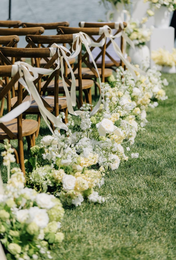
Walk into a room built around butter yellow, and it reads as warm before you can explain why. It isn’t a bright, citrusy yellow. It’s the softest possible version of the color—closer to fresh cream and early-morning light than to anything bold. Paired with cream and a subtle, grayed sage, it feels open and generous, with just a touch of nostalgia.
It’s also the defining color story of 2026, and it didn’t start with weddings. Butter yellow moved through fashion and interiors first—runway collections, paint swatches, the kitchen renovations filling your feed—and the wedding world caught up quickly. The Knot and Zola have both named it a breakout shade for the year, while sage green continues to rank among the most requested wedding colors. Together, they feel less like a trend than a mood: optimistic, relaxed, and distinctly warmer than the cool neutrals that dominated for years.
A butter yellow wedding palette works almost anywhere, but it really comes alive in natural light. Gardens, farms, vineyards, and estates with tall windows all bring out its softness. At golden hour, butter yellow is especially luminous.
In florals, picture cream garden roses layered with pale yellow blooms and plenty of soft, textural greenery—arrangements that seem to catch the light rather than compete with it. The effect is full and relaxed, with nothing that feels overly styled.
If one palette captures the mood of summer 2026, this is it.

2. Coastal English Garden
Dusty Lilac · Hydrangea Blue · Soft Peach · Cream
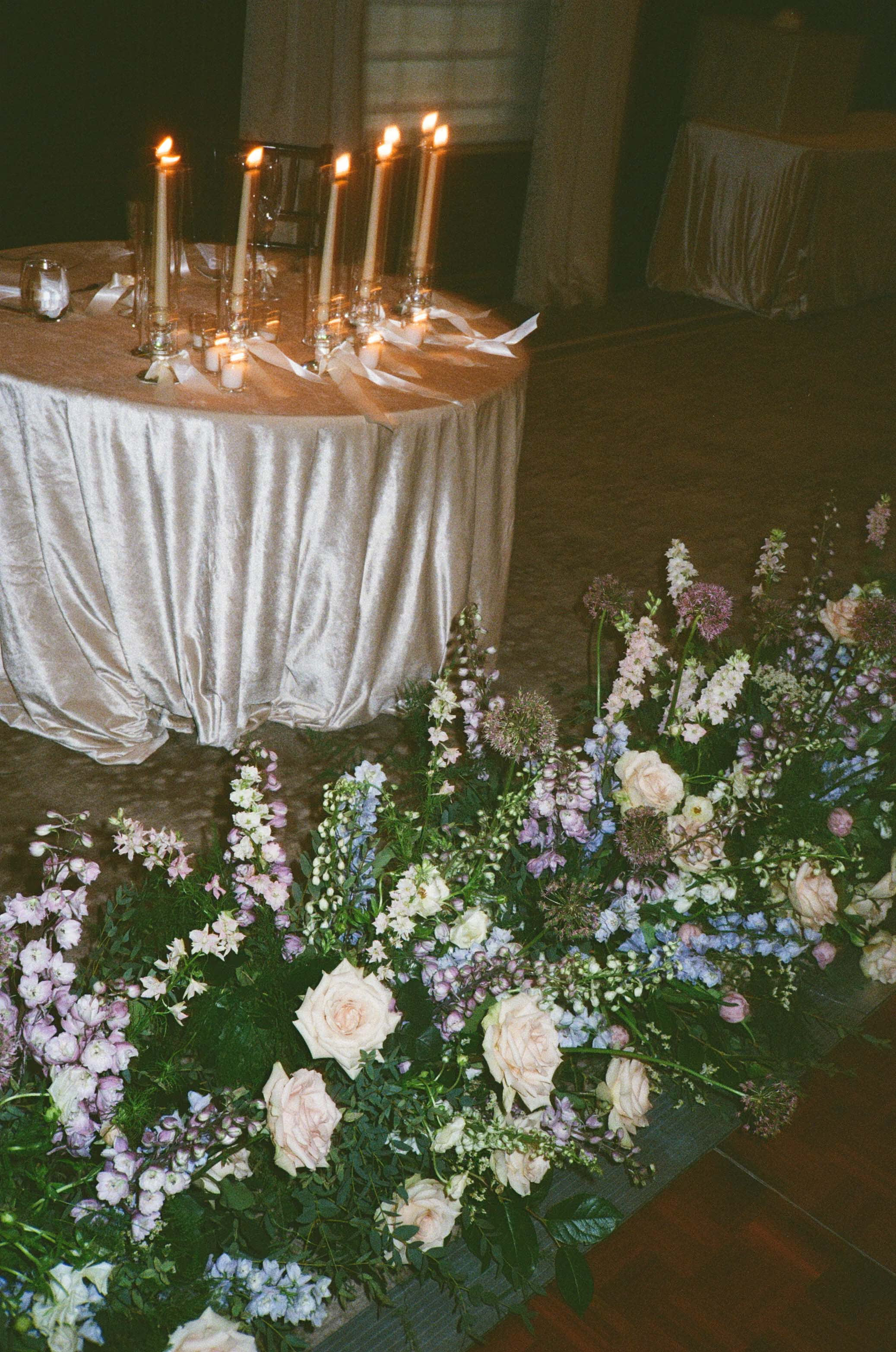
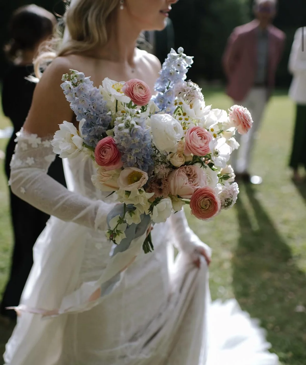
This is the palette reminiscent of a watercolor—soft edges, colors that bleed gently into one another, nothing too sharp or defined. Dusty lilac, hydrangea blue, soft peach, and cream sit together the way colors do in an English garden: a little wild, slightly faded, and never intended to match perfectly.
What makes it work is the mix of temperatures. Most pastel palettes commit to one direction, either warm or cool. This one does both at once. The lilac and blue bring a sense of calm, while the peach and cream add warmth and light. That tension is what keeps these dusty lilac wedding colors from feeling like just another pastel palette. The effect is European and lived-in—less Pinterest grid, more garden that has been evolving for decades.
It feels especially at home in places with texture and history: estate venues, garden ceremonies, coastal celebrations, or anywhere with old stone, mature greenery, or a long view. A palette this nuanced benefits from a backdrop with character.
For florals, think loose, gathered arrangements that feel picked rather than arranged, with stems that arch and move naturally. Hydrangeas do much of the work here, giving the arrangements body and that signature watercolor haze. Romantic, yes, but never too precious.
3. Maximalist Brights
Marigold · Fuchsia · Cobalt
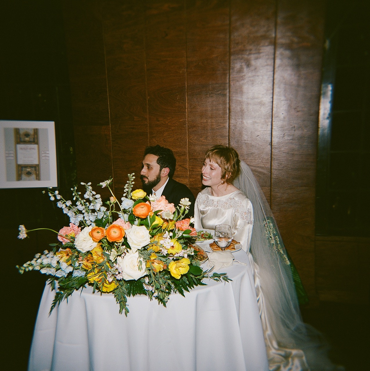
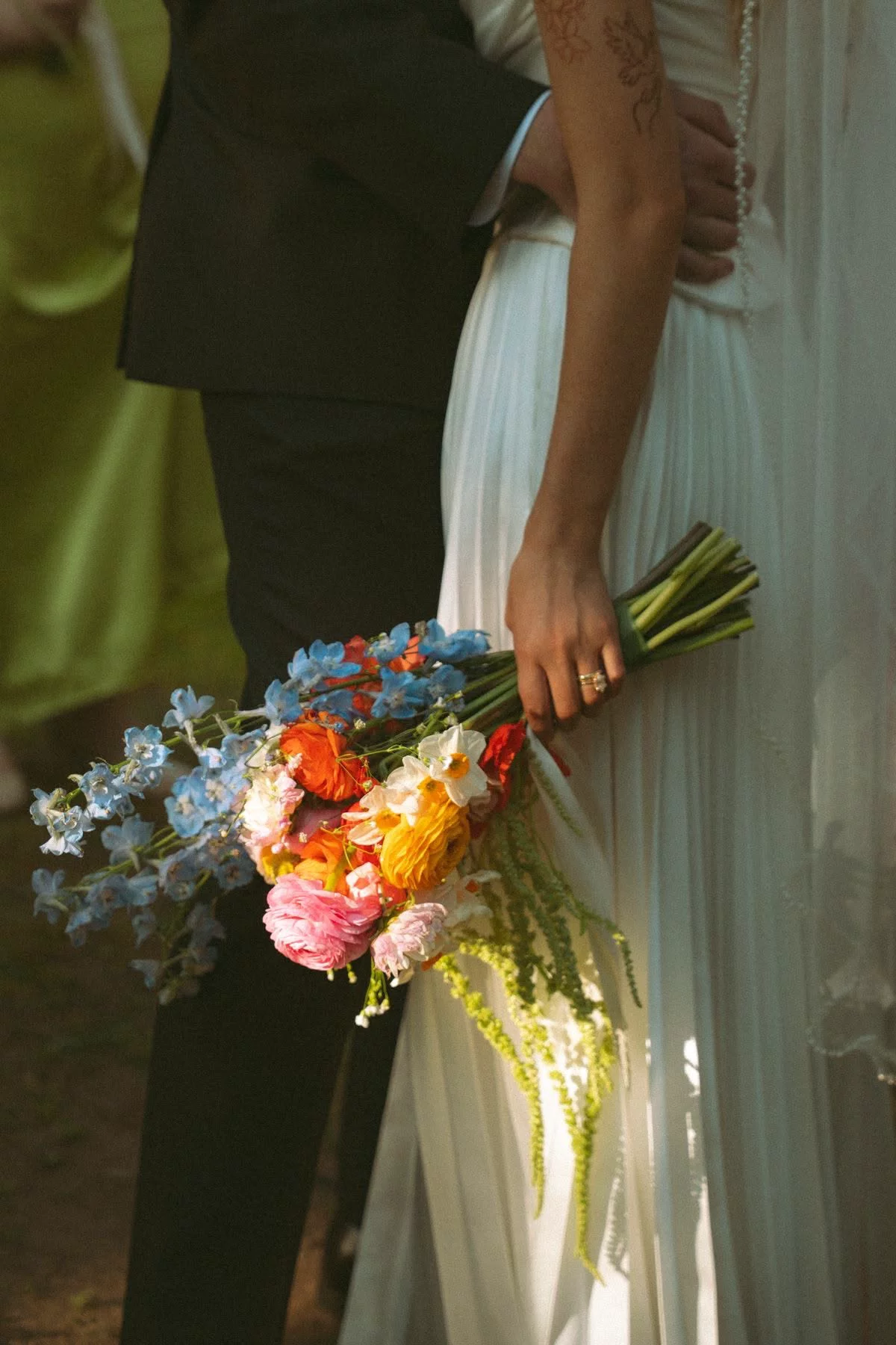
This is the boldest palette in the set, and it isn’t trying to be understated. Marigold, fuchsia, and cobalt together are joyful, energetic, and completely sure of themselves. A room designed around them registers immediately as an event—somewhere something memorable is happening.
Bold wedding color combinations like this are having a real moment, driven by fashion’s return to maximalism and a broader design culture that is embracing color again. This is the palette for couples who want their wedding to feel like an experience rather than a template. It also happens to photograph beautifully.
It needs the right space. Modern venues, galleries, lofts, restaurants, or outdoor areas with a clean, simple backdrop all give these colors room to shine. Against a neutral setting, the palette feels vibrant and intentional.
The floral side comes with one practical note. Marigold and fuchsia offer real depth and range. Cobalt is more elusive: true blue is relatively rare in nature, which is where an experienced designer makes the difference, building the blue through flowers like delphinium and iris so the trio feels balanced rather than overwhelming.
Done well, the result is saturated, graphic, and hard to forget.
Not sure which of these feels most like you? Our Style Quiz is a quick way to find your direction →
4. Heirloom Romance
Mauve · Dusty Rose · Antique Gold
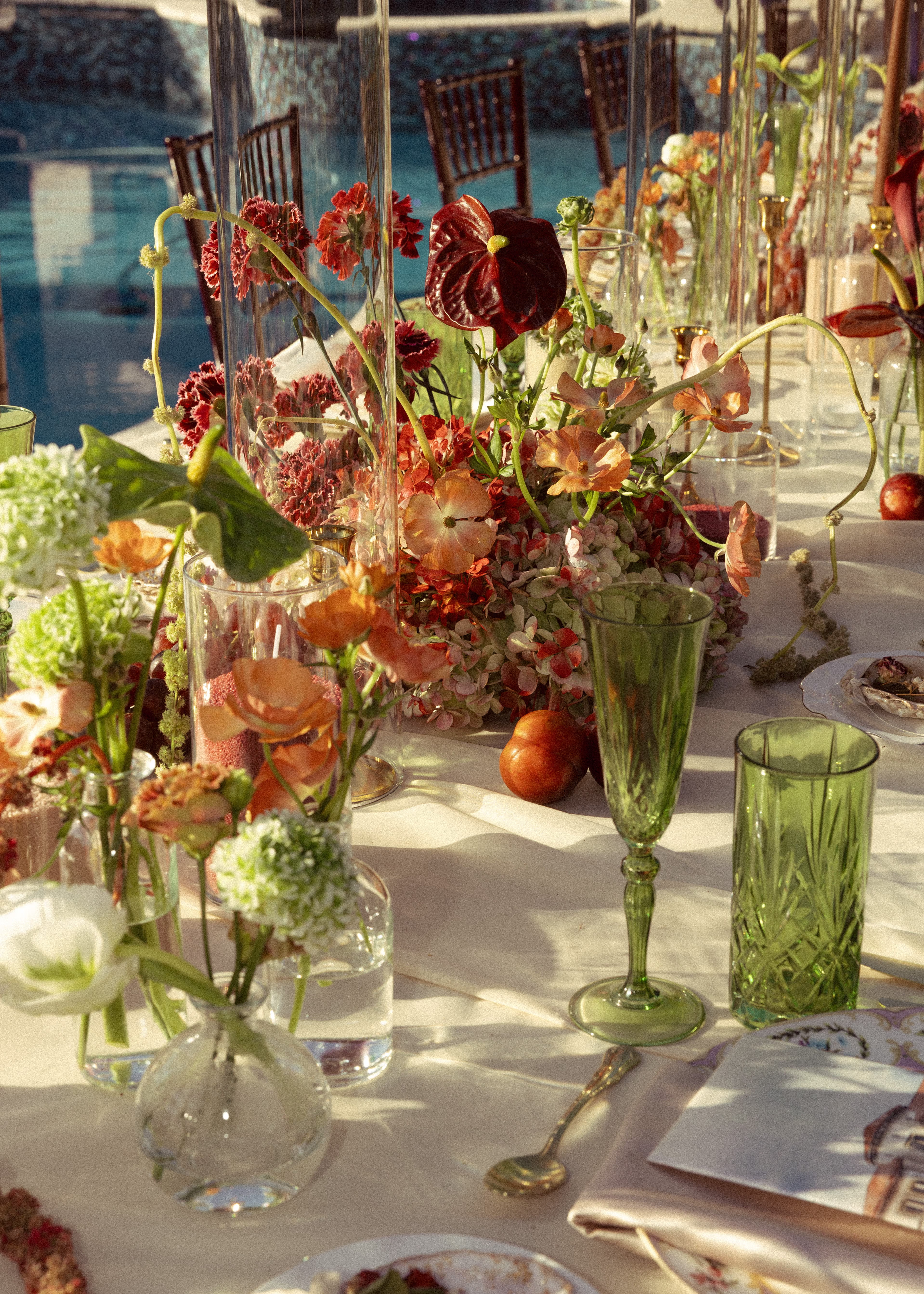
Heirloom Romance is warm and a little shadowed—the palette equivalent of candlelight. Mauve and dusty rose give it softness and depth, while antique gold runs through the whole thing. It feels nostalgic, but it never tips over into costume.
On paper, a mauve and antique gold wedding could easily read as 2019 vintage. What keeps this version firmly current is restraint—and the gold itself. Used as a metallic accent rather than a full color, antique gold pulls the palette into a Renaissance-meets-modern space: painterly, grown-up, and a little moody. We're seeing couples reach for this when they want romance with weight to it, not just prettiness.
It's made for rooms that already have warmth built in. Historic venues, libraries, wood-paneled spaces, warm-toned ballrooms—anywhere with brick, wood, or candlelight in the architecture. This palette and a table full of taper candles are made for each other.
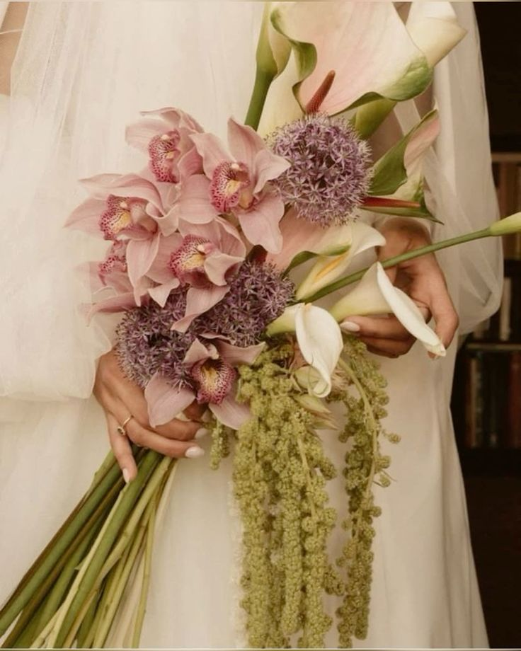
In florals, that translates to deep, dimensional arrangements: blooms in mauve and dusty rose layered close together, with darker tones tucked underneath for shadow and depth. The gold stays in the details: a vessel, a candlestick, a thin line of it along the table. The overall feeling is full, soft, and gently old-world, like a still-life painting you could step into.
5. Ivory, With an Edge
Ivory-on-Ivory · Chartreuse
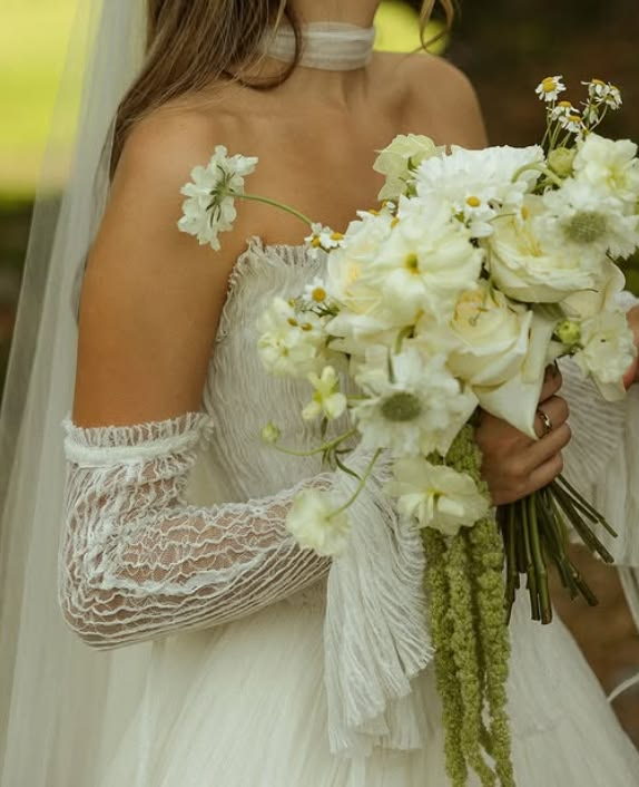
This palette is proof that a white wedding doesn't have to mean a boring one. An ivory-on-ivory palette is built entirely on texture and tone—layers of cream, bone, oyster, and warm white doing the job color usually does. On its own, it’s elegant but expected. Then comes the chartreuse: one sharp, slightly acidic green that works like a punctuation mark and gives the whole palette its personality.
An ivory and chartreuse wedding feels modern precisely because the chartreuse is unexpected—it's the opposite of a safe accent choice. Chartreuse has been named a forecasted accent shade for 2026 ceremony and reception design, and it works because it's the one high-contrast note in an otherwise pale, tonal palette—a bright, almost electric green against all that ivory. It keeps an all-white palette from sliding into bridal-magazine default and hands it some edge instead.
It suits almost any venue, but it's most striking in minimalist, architectural, or all-white spaces, where the restraint clearly reads as a choice rather than a lack of one. In a blank, modern room, it looks deliberate.
For florals, think sculptural and restrained—white blooms chosen as much for their shape and texture as their color, with chartreuse threaded through for movement: a trailing stem here, a green bloom catching the eye exactly where you don't expect one. Minimal, but never boring. That's the entire point.
Start With the Feeling
If there's one thread running through all five of these, it's this: each began as a feeling long before it became a palette, and a palette before it became flowers. You don't need to know a single stem name to start. You need to know how you want your wedding to feel—warm and golden, soft and layered, loud and joyful, candlelit and rich, or clean and a little sharp—and the florals follow from there. The summer wedding flower colors that feel most like you almost always begin that way: as a feeling, not a list.
That's the part our designers love most: taking a color instinct and translating it into something seasonal and real. And because Poppy works with fresh flowers—real blooms, never faux— sourced farm-direct, even the harder-to-find shades in these palettes are achievable, not just aspirational.
So save the palette that made you stop scrolling, and trust that instinct. It's a far better starting point than any rulebook. When you're ready to see what your favorite looks like as a real floral plan, that's the natural next step.
See what your wedding flowers could actually cost →