


Trends & Inspiration
Fall 2026 Wedding Flowers: The Palettes, Stems, and Moods to Know Now
Trends & Inspiration
Search for fall wedding flower trends and you’ll find the same version of the season over and over again: burgundy, rust, maybe a moody brown, a list of “must-have” stems, and a few familiar Pinterest boards recycled in different lighting.
For fall 2026, the conversation has shifted. It’s less about a single trending color and more about distinct aesthetic worlds—each with its own emotional tone, palette logic, and way of using flowers to shape a space.
Which is a subtle but important shift. Because suddenly the question isn’t “what’s trending this fall?” It’s: What do you want it to feel like when you walk into the room?
That’s what we’re working with here. Four directions we’re seeing over and over again—each one distinct enough that you can actually recognize yourself in it.
Still figuring out your direction? Our style quiz is a great place to start →
Moody Romance
This is probably the most searched fall wedding aesthetic for a reason. And it keeps refining itself.
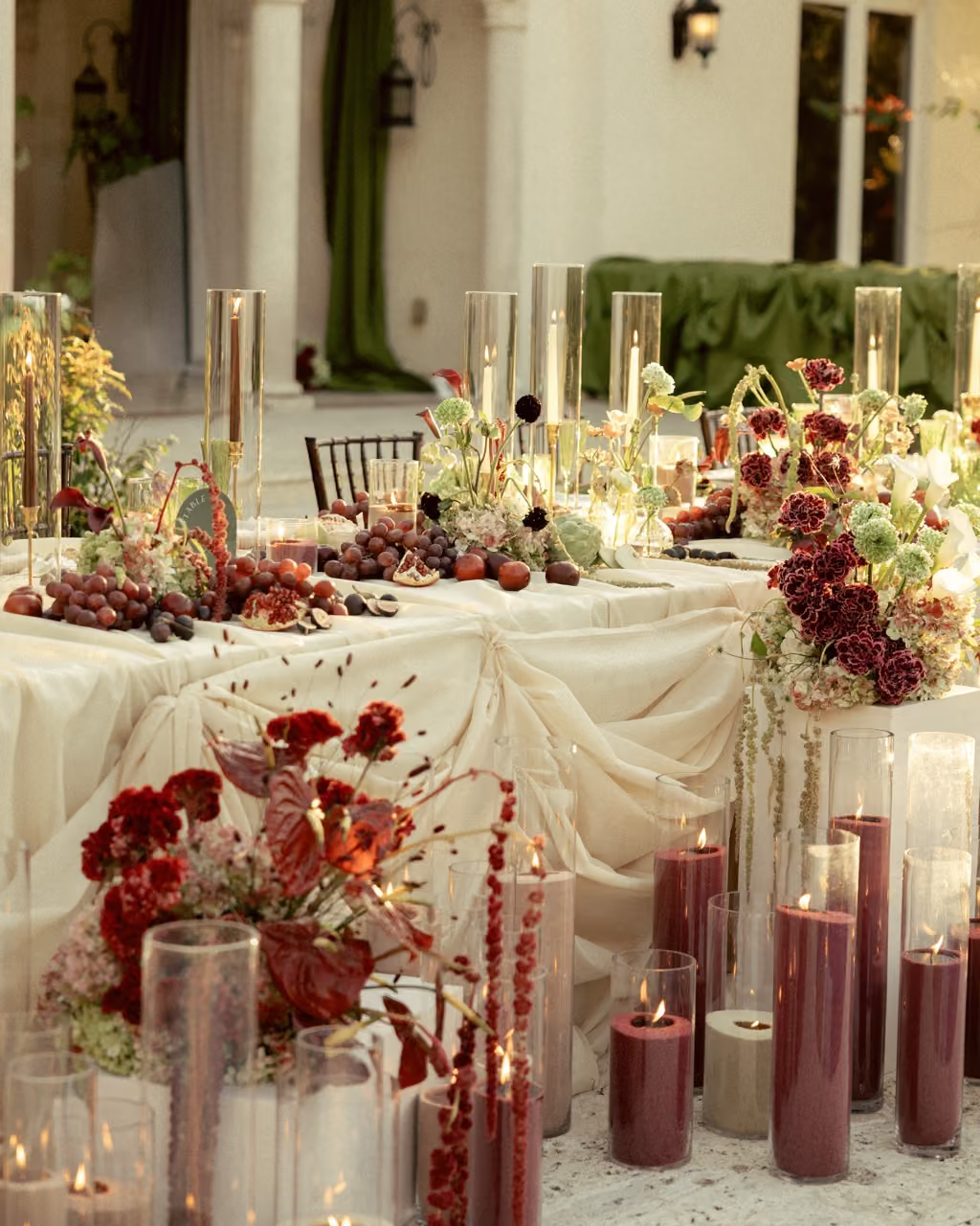
At its core, Moody Romance is about atmosphere. Deep jewel tones, candlelight, florals that feel like they belong in a room with dark wood, worn stone, and tall windows that don’t need much dressing. But the version showing up in fall 2026 feels more editorial than rustic.
Think less harvest table and more dinner party at a historic estate.
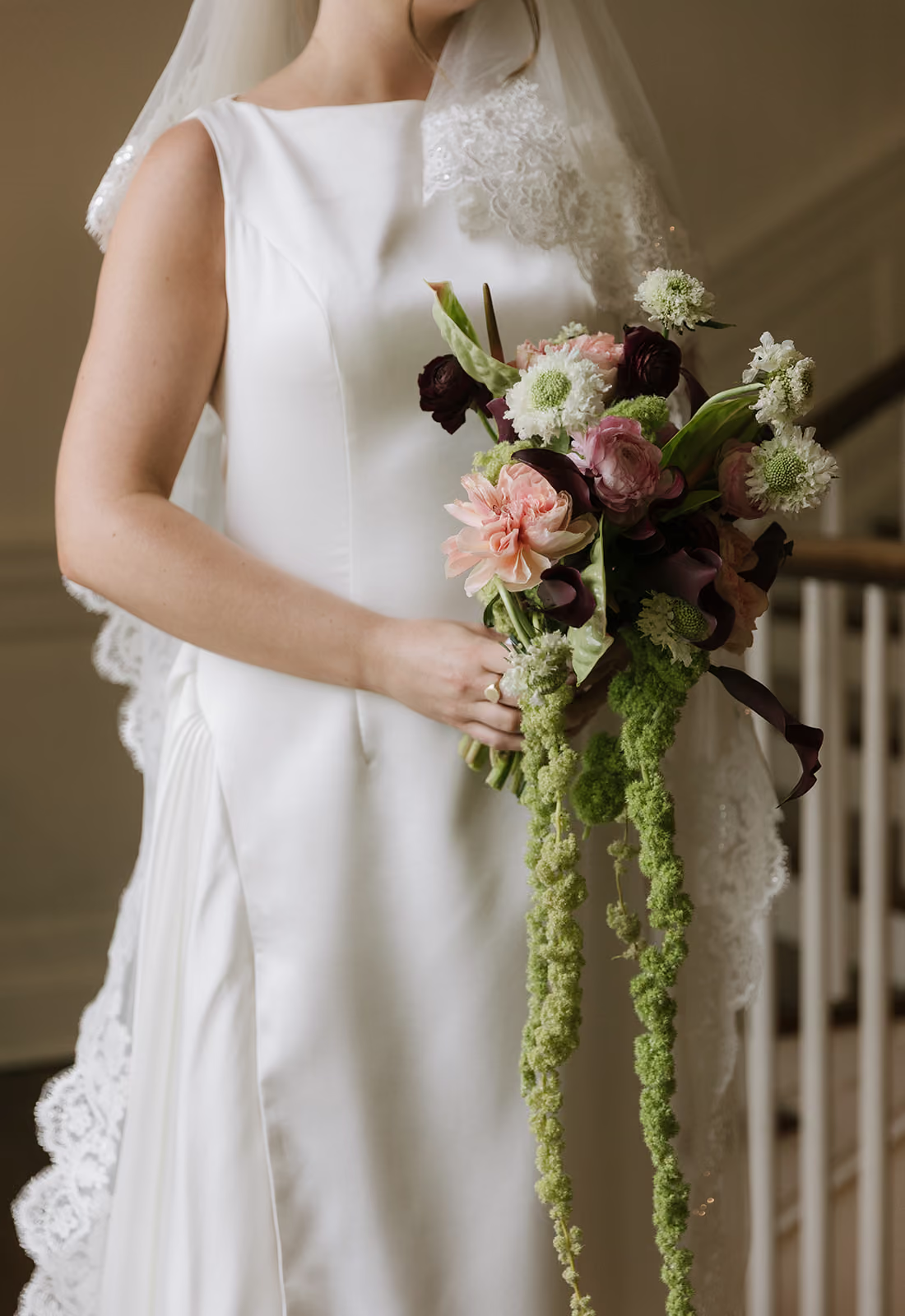
The palette includes those deep, layered tones—burgundy, plum, aubergine—with emerald or deep green used sparingly to break things up. Cream or soft ivory keeps everything from feeling too heavy. The restraint is what makes it feel current. It’s not every shade of fall thrown together.
Texture does most of the work here. Dahlias—especially the darker varieties that open fully and hold their shape in low light—are everywhere. Plum ranunculus add layers without bulk. Chocolate cosmos show up in moments you only notice up close. Dark garden roses and black-centered anemones give structure and contrast without breaking the palette.
This aesthetic works best in venues with strong bones: converted lofts, historic estates, libraries, museum spaces where candlelight becomes part of the design. Places where the flowers don’t need to create the mood—they just need to match it.
The arrangements themselves feel composed, not stiff, but intentional. Built for long tables, dim lighting, and a full evening around them.
Warm Earth
This is what happens when terracotta stops feeling trendy and starts feeling personal.
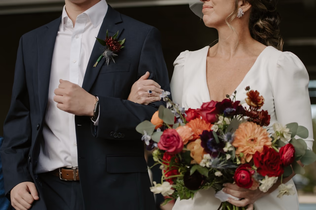
Warm Earth still pulls from familiar fall tones, but the palette is softer and more layered now: amber, cinnamon, warm caramel, muted olive, sage. Cream that reads warm instead of bright. Maybe a dusty rose somewhere in the mix. Everything has depth and warmth without heaviness.
What separates this look from earlier terracotta-heavy weddings is the restraint behind it. There’s a noticeable Japandi influence in the way couples are approaching these florals—more editing, more negative space, fewer “filler” moments. Not everything needs to be overflowing to feel finished.
Café au lait dahlias show up here a lot because they hit that creamy caramel middle ground better than almost anything else. Garden roses in apricot and peach soften everything without making it sweet. Cosmos and scabiosa add movement that feels slightly undone in the best way.
And then there’s the texture layer: dried grasses, seedpods, preserved stems. Not added as decoration, but integrated intentionally into the overall shape of the design.
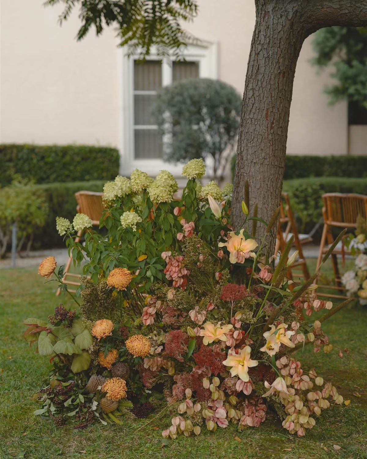
This aesthetic fits naturally into venues that already feel warm: vineyards at golden hour, garden spaces, light-filled neutral interiors. The flowers aren't fighting the environment. They're extending it.
The arrangements feel loose at first glance, but that’s deliberate. Nothing overcrowded or overly polished. It’s a very controlled kind of ease.

Tonal Drama
Monochromatic florals aren't new, but the way they're being used now feels more architectural. And it's showing up across every season, not just fall. It’s one of the strongest cross-seasonal movements in current wedding design.
The idea is simple: commit fully to one color family and work across its entire range. All burgundy. All rust. All plum. Champagne fading into cognac. Instead of building contrast through color, everything happens through depth and texture. And that’s what makes these arrangements so compelling in person.
You start noticing how many shapes can exist inside a single palette—tight buds against fully open blooms, matte petals beside glossy ones, ruffled flowers next to cleaner, sculptural forms. The arrangement becomes about structure instead of color variety.
For fall specifically, this works especially well with palettes that naturally carry a wide tonal range: rust into amber, burgundy into wine, plum into aubergine. There’s enough variation built in to keep everything from feeling flat.
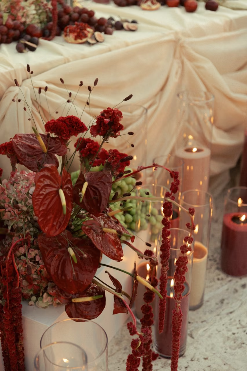
Dahlias work especially well here because they range so much in tone—one variety can move from soft blush to deep claret. Garden roses and ranunculus do the same thing, which is what makes tonal arrangements feel layered and dimensional without introducing another color.
These designs tend to feel sculptural rather than garden-inspired, more composed.
They’re also surprisingly versatile across venues because a tonal palette rarely fights with the room around it. It adapts without disappearing.
If you’ve ever saved an image of an entirely plum tablescape or an all-red bouquet and couldn’t explain why it felt so striking, this is probably why.
The Unexpected Edge
This is the direction for anyone tired of being told fall has to mean burgundy.
The palette here is built around combinations that don’t usually show up in traditional autumn wedding design: black with dusty mauve, deep teal with copper, cobalt blue next to warm brass or gold. Colors that feel modern and slightly provocative—but styled with enough restraint that the result reads editorial rather than costume-y.
The defining quality isn't the specific colors. It's the confidence behind the choices. There's no "and we'll soften it with some greenery." The arrangement commits to the direction fully and that’s exactly why it works.
Flowers in this world tend to lean graphic over romantic. Black-centered anemones are popular here, as are dark hellebores, protea, sculptural branches, and calla lilies in deep plum or almost-black. Usually the flower selection is intentionally limited, with each stem chosen for shape and silhouette as much as color.
You also see a shift away from traditional centerpiece formats. Long rows of bud vases, low sculptural arrangements, tablescapes that mix heights and vessels in unexpected ways. The negative space is part of the design.
This aesthetic naturally fits modern spaces—lofts, galleries, rooftops, industrial venues with clean lines. But it doesn't rely on the venue for atmosphere. It creates its own.
If you keep saving wedding images that don’t quite fit into any of the usual categories, this is probably your world.
By now you probably have a sense of which direction you’re drawn to—or maybe you’re somewhere between two of them, which is also a totally reasonable starting point for a design conversation.
And that’s really the point. Fall 2026 wedding flowers aren’t being defined by one trending stem or one color palette. They’re being shaped by mood, restraint, texture, scale, and the way arrangements interact with a space.
Once you know what you want it to feel like, everything else gets easier to define—including budget.
See what your fall flowers could cost →
And if you’re still narrowing in on your aesthetic, the style quiz takes about two minutes and gives you a useful starting point before talking with a designer.