


Trends & Inspiration
How to Choose a Wedding Color Palette: 13 Signature Palettes to Explore
Trends & Inspiration
Choosing a wedding color palette is one of the first design decisions couples make—and it influences nearly everything that follows.
Your palette shapes the look of your florals, linens, stationery, attire, and even the way your photos feel. The goal isn’t finding the “perfect” color formula. It’s choosing colors that feel personal while working naturally with your venue, season, and floral design.
Below are 13 palettes we’re seeing couples gravitate toward in 2026, along with guidance on how to build your own.
Why Your Wedding Color Palette Matters
Your color palette acts as the visual foundation of your wedding design.
When chosen thoughtfully, it helps create cohesion across:
- Florals
- Table design
- Attire
- Invitations
- Ceremony décor
- Photography
The most successful palettes balance personal meaning with visual harmony.
A color you love should still complement the architecture of your venue, the season of your wedding, and the flowers available at that time of year.
A Simple Way to Build a Color Palette
Designers often use a simple ratio when building palettes:
60% Primary Color
The dominant tone used in florals, linens, and larger design elements.
30% Secondary Color
Supporting tones that add depth and contrast.
10% Accent Color
Small details like ribbon, table accents, or metallic elements.
Before finalizing your palette, always test colors under your venue’s lighting conditions. Daylight, candlelight, and evening lighting can shift undertones dramatically.
How to Choose the Right Wedding Colors
If you’re starting from scratch, these questions can help guide your palette:
Look at your venue
Architecture, wall colors, and surrounding landscapes often suggest natural palettes.
Consider the season
Certain tones feel more natural in specific seasons—pastels in spring, deeper jewel tones in fall.
Balance neutrals and color
Most palettes work best when one or two colors are paired with softer neutrals.
Limit your palette
Three to four tones usually create the most cohesive design.
13 Wedding Color Palettes for 2026
Below are some of the most popular palettes couples are choosing right now.
Blush
Romantic · Soft · Elegant
Blush remains a timeless choice for romantic weddings. When paired with ivory and touches of sage or dusty green, it creates a soft, layered look.
Common flowers: garden roses, ranunculus, peonies, lisianthus.
Elegant White
Timeless · Minimal · Refined
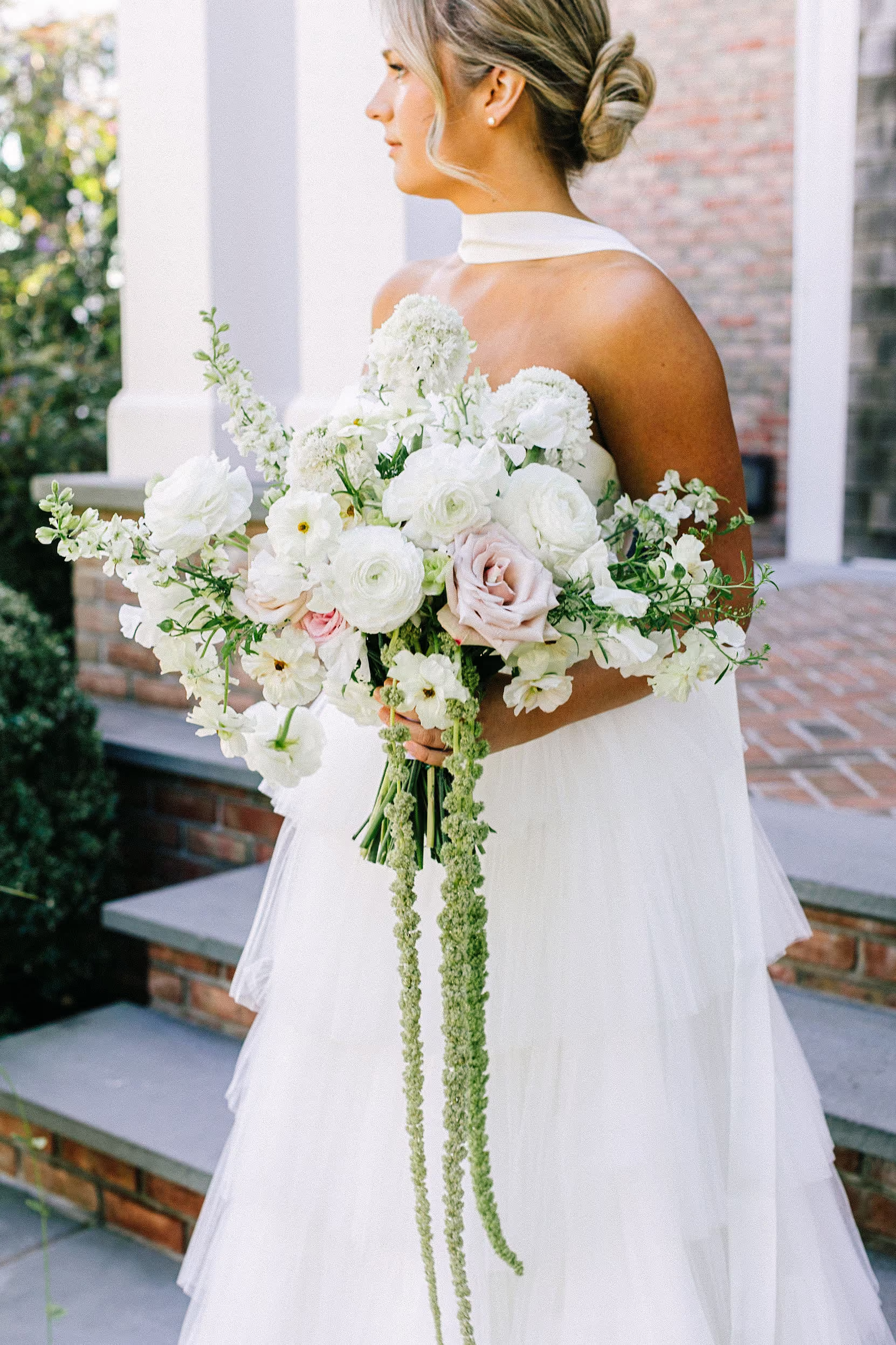
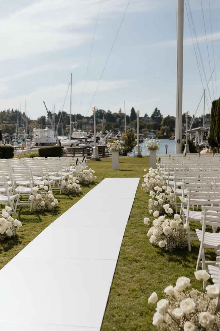
All-white florals create a clean, sophisticated aesthetic. Texture becomes the key design element, using combinations of hydrangea, roses, orchids, and anemones.
Perfect for modern venues or historic estates.
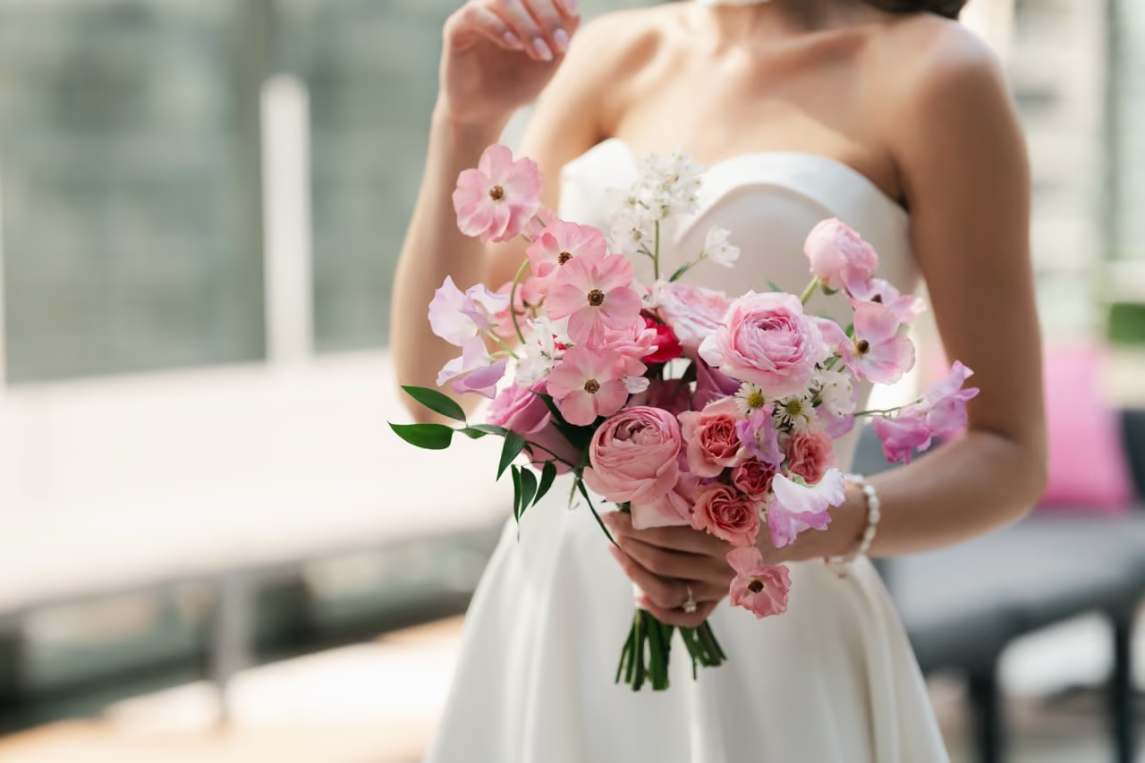
Pink
Classic · Feminine · Fresh
Pink palettes can range from soft ballet tones to vibrant raspberry hues. A tonal pink palette works beautifully in garden settings.
Common flowers: peonies, ranunculus, roses, spray roses.
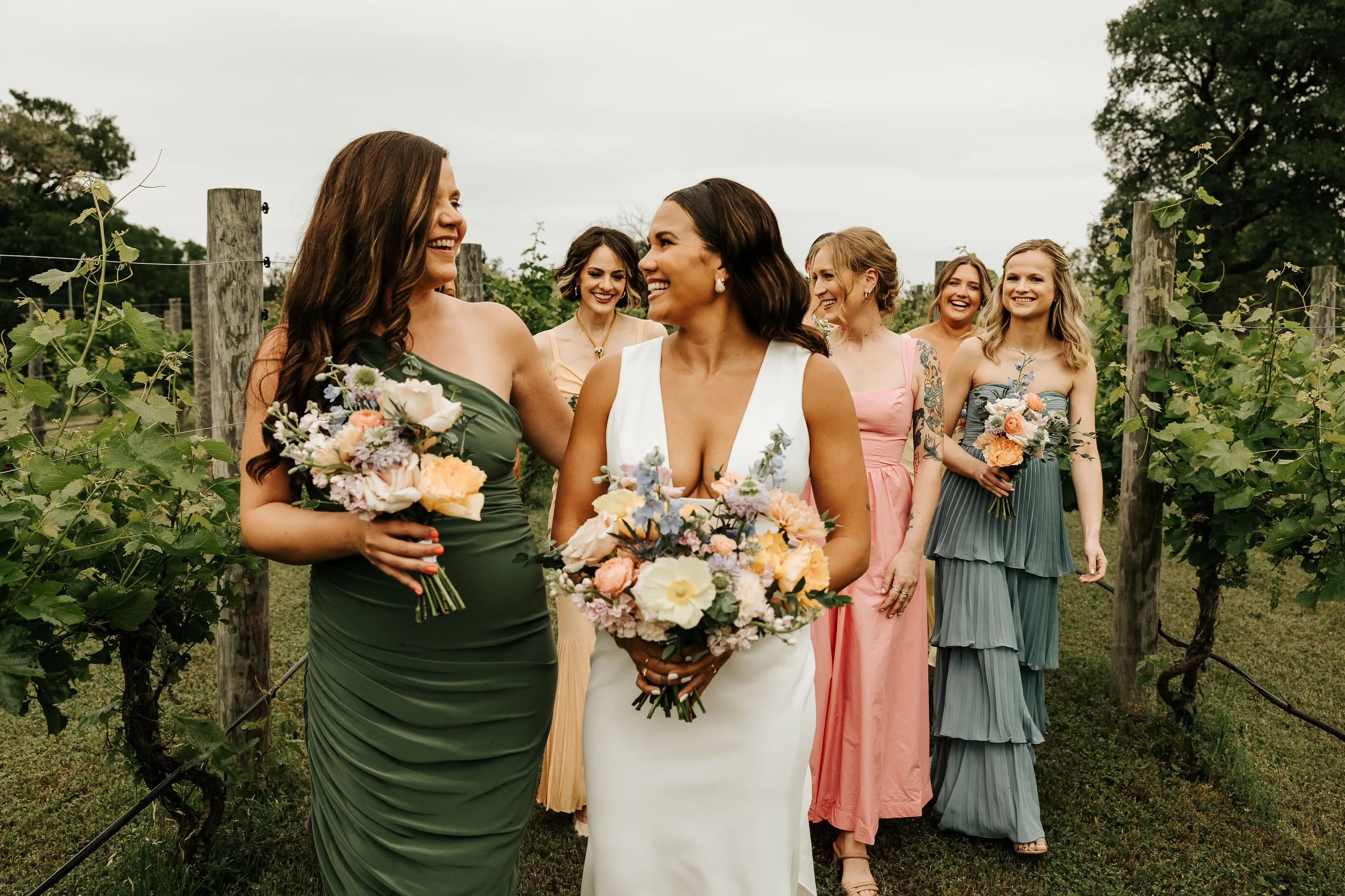
Pastels
Whimsical · Light · Spring-Inspired
Lavender, buttercream yellow, soft peach, and mint create a dreamy pastel palette that feels perfect for outdoor celebrations.
These colors pair beautifully with garden-style floral arrangements.
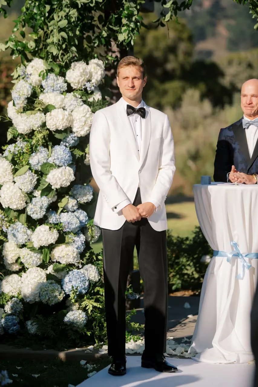
Coastal Blues
Airy · Calm · Coastal
Soft blue tones paired with crisp white evoke a breezy coastal feel.
Common flowers: delphinium, hydrangea, tweedia.
Ideal for waterfront venues or summer weddings.
Citrus Brights
Energetic · Playful · Summer
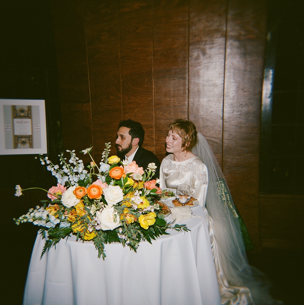
Bold tones like lemon yellow, coral, and tangerine create a vibrant palette that feels joyful and celebratory.
These colors work beautifully with dahlias, zinnias, and marigolds.
Desert Warmth
Warm · Earthy · Modern
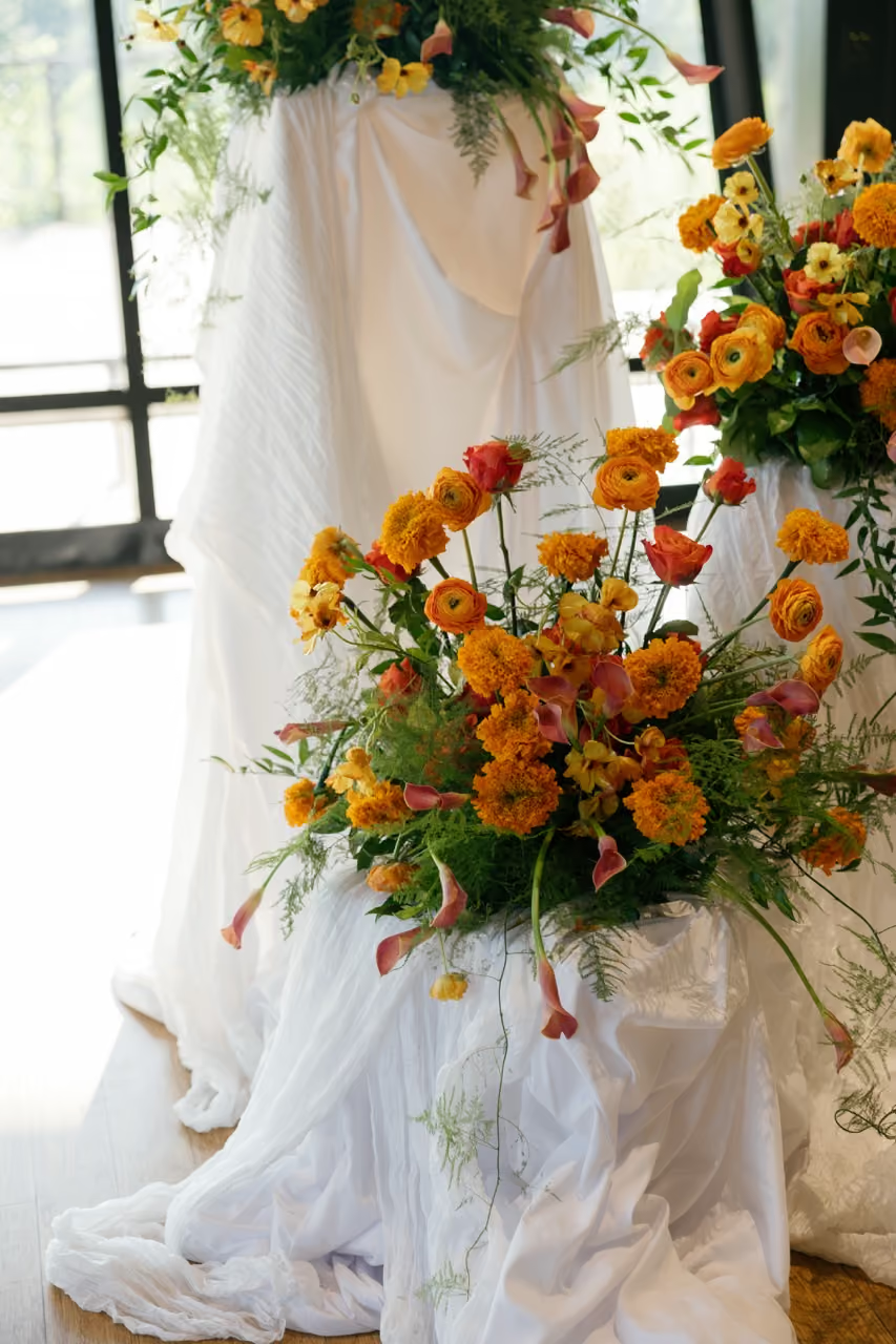
Terracotta, amber, and ochre tones create a warm palette that pairs beautifully with natural landscapes and rustic venues.
Common flowers: dahlias, toffee roses, amaranthus.
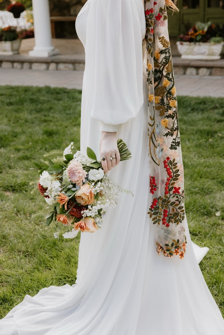
Earth Tones
Organic · Natural · Relaxed
Muted greens, clay tones, and soft browns create a grounded, nature-inspired palette.
This look pairs beautifully with textured vessels, dried elements, and organic arrangements.
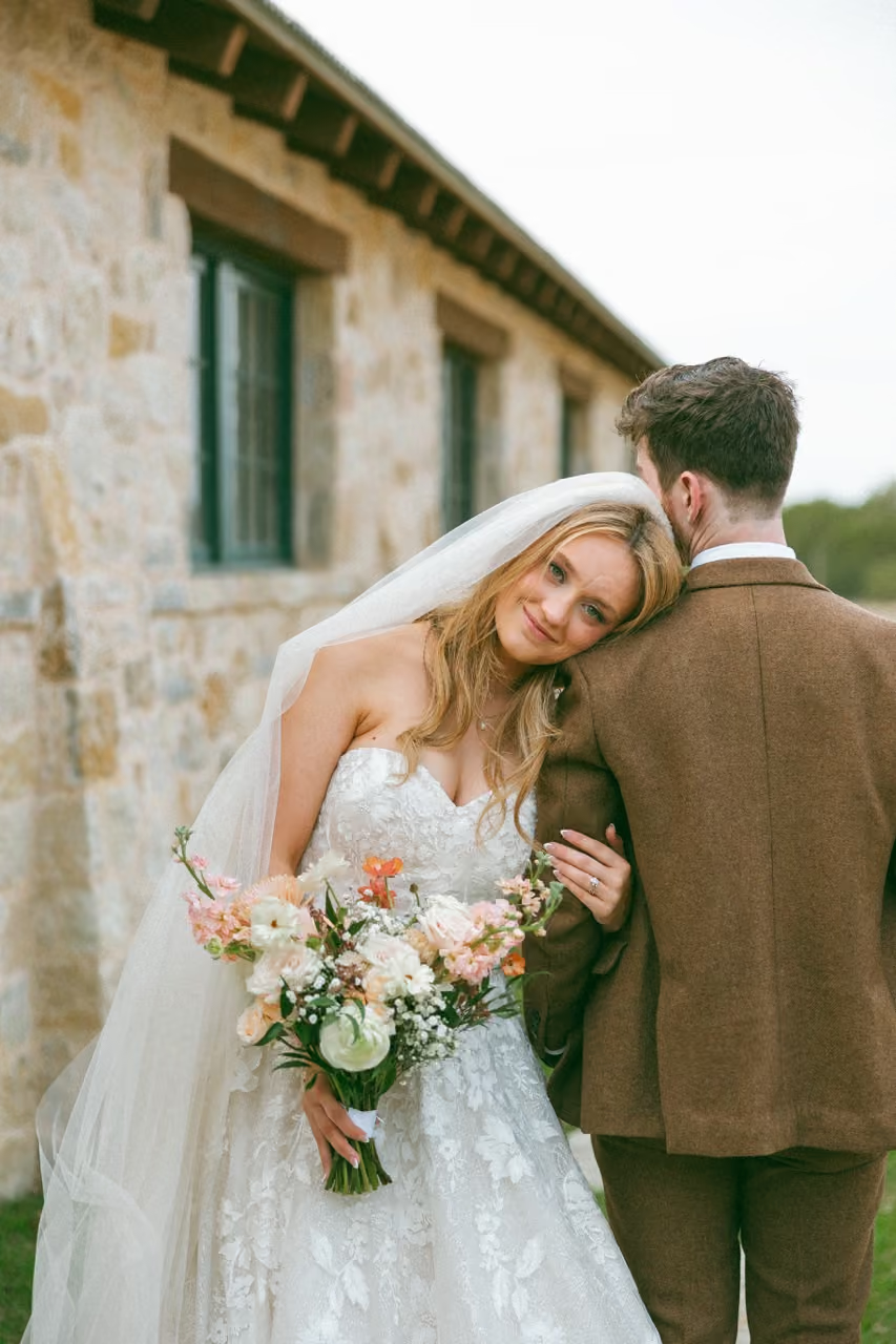
Rainbow
Playful · Joyful · Expressive
Rainbow palettes celebrate color in all its forms, often using soft tonal gradients or ombré arrangements.
Bud-vase tablescapes are a great way to incorporate multiple colors naturally.
Photo by Jazmin Solano Photography

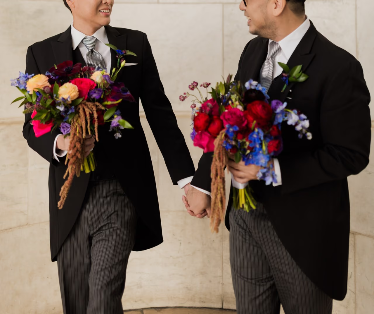
Jewel Tones
Rich · Dramatic · Luxurious
Deep emerald, sapphire, and ruby tones create an elegant and dramatic look.
These palettes pair beautifully with metallic accents like gold vessels or candle holders.
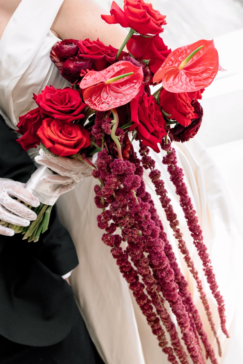
Bordeaux
Romantic · Moody · Elegant
Deep wine, plum, and burgundy tones create a rich palette that feels especially beautiful in fall and winter weddings.
Common flowers: dahlias, ranunculus, scabiosa.
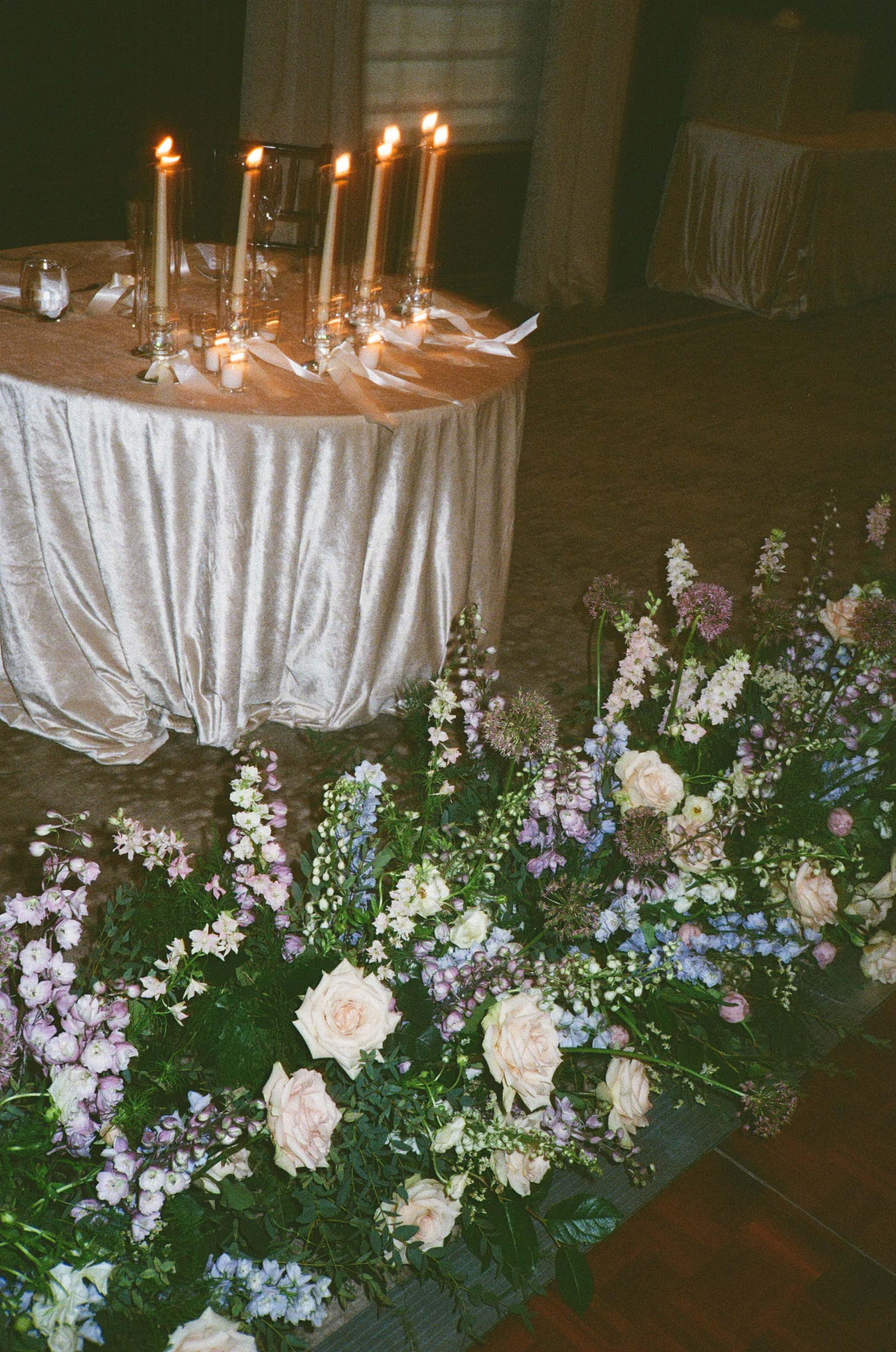
Twilight
Moody · Evening · Dramatic
Navy, plum, and burgundy tones paired with crisp white accents create contrast and depth.
This palette works particularly well for evening ceremonies.
Golden Hour
Warm · Radiant · Sun-Inspired
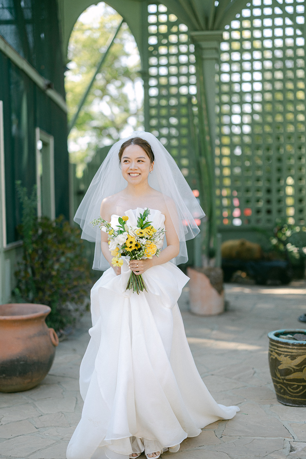
Soft amber, champagne, and warm yellow tones evoke the glow of sunset.
These colors pair beautifully with garden roses, ranunculus, and chamomile.
Ready to Find Your Wedding Style?
If you’re still exploring your wedding colors and floral style, the easiest next step is discovering what feels most like you.
Take Poppy’s 2-minute Style & Budget Quiz to explore design directions and see what floral options fit your vision and budget.